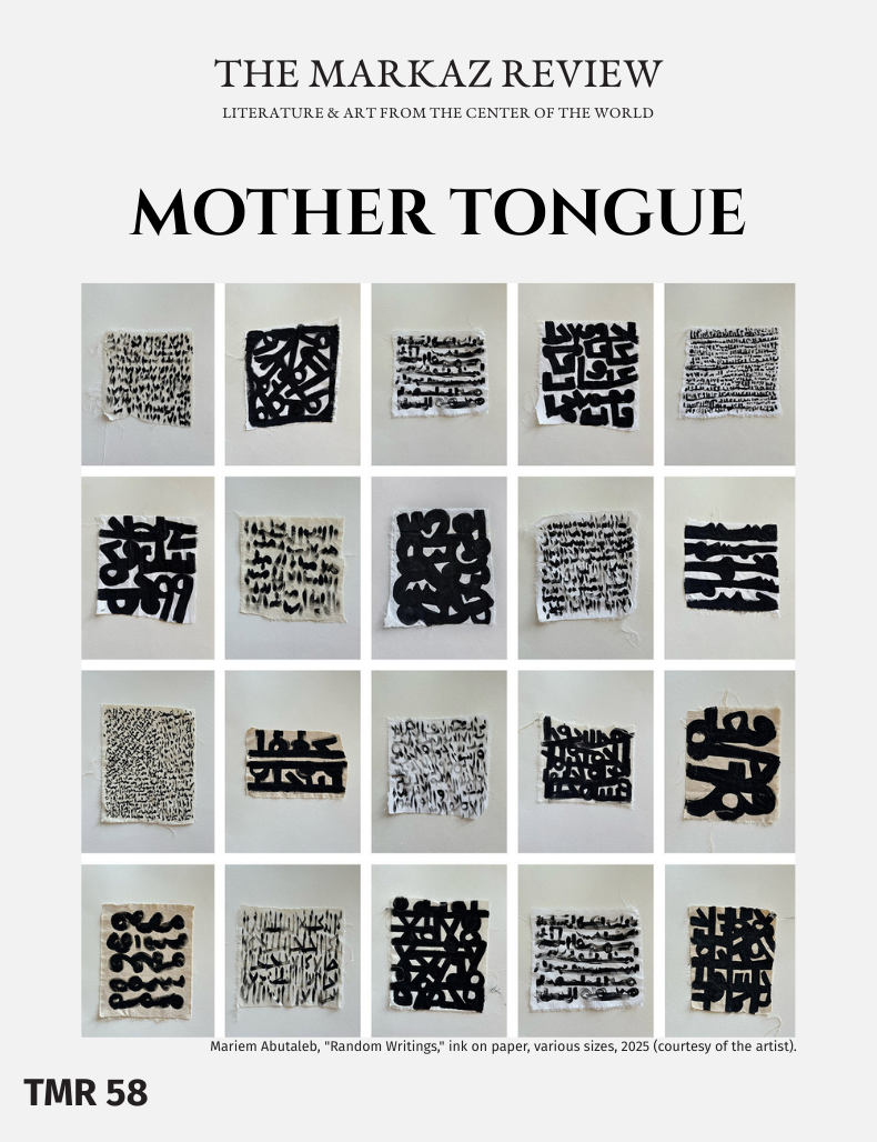
In which a young artist goes beyond words, beyond this or that language, to create meaning with signs and symbols of her own creation.
What if we didn’t have a mother tongue? What if we could (metaphorically) sing together an ecumenical “Imagine” — as if all the languages in the world were one, and we were only distinguishable, say, by our rhythm, cadence, or accent? Could we ever imagine a world where understanding one another wouldn’t require rules of grammar and the gymnastics of language switching?
Mariem Abutaleb can imagine that. In the work of the young Egyptian artist, the Arabic language and alphabet become a symphony of signs that attempts to remove barriers. “When writing transcends readability, it’s meant to be felt,” says the artist. Her work is a visual demonstration of this idea. If from afar, her work looks as familiar as calligraphy, it’s only by coming close that one realizes she’s not referencing a specific language. And it’s precisely in this fluid approach that her artistic practice lies.
In fact, in her multimedia work — one that develops across paper, canvas, scroll, and design objects — text rarely references a literary passage or a text. Abutaleb’s prime motivation is a play around signs and the concept of writing itself. Her marks do resemble the Arabic script, but her point is to create harmonious compositions. She conceives of writing as an act rather than a means to an end; a gesture independent from the meaning of the words themselves.
“When I say that writing is meant to be felt rather than read, I refer to an experience that becomes unique to each viewer, shaped by their perception and interaction with the work,” she further articulates.
To the artist, Arab script operates as a visual and emotional language, where meaning is conveyed through rhythm, pattern, and density. “The viewer is invited to pause and reflect, allowing writing to unfold as a living, embodied experience.” Abutaleb believes that letters have the potential to be magically developed into interesting, unpredictable patterns. “It might take the audience a while to recognize that what they are looking at are letters owing to the unlimited options of experimentation and applications,” she says. Each piece develops its own visual language, even though all are generated from the same script.
Abutaleb studied graphic design at the American University in Cairo, where she plunged head on into the fields of typography and type design. That academic foundation sharpened her awareness of structure and layout, and yet she does not attribute her lettering style to formal calligraphic training.
“I’ve developed my style by myself,” she says. “It wasn’t something I set out to study in a formal sense, but rather something that unfolded throughout my experimental process. It all came out spontaneously, driven by a mix of curiosity and the natural evolution of my interests.”
Her studio environment mirrors this approach and sustained exploration. Large wooden panels dominate the space, marked with ink and traces of fabric. She stretches textiles across them, securing them with clips to create expansive working surfaces that extend two meters or more. Another section functions as a living archive, where works from previous years form an ongoing visual record of her journey. A separate room is dedicated to storing and collecting fabrics gathered since the beginning of her practice, each textile waiting to be transformed through ink.
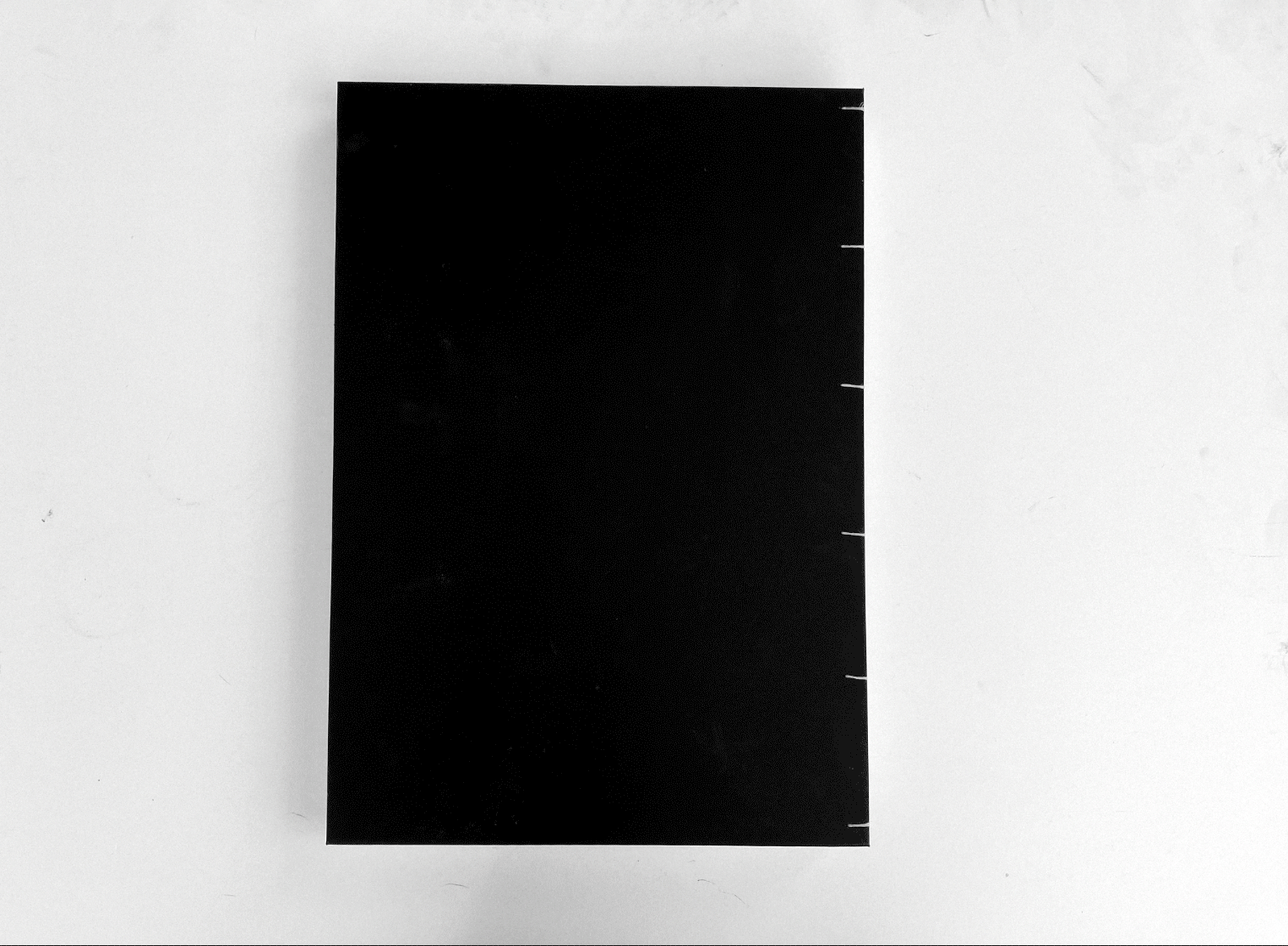
Book of Diaries (courtesy Mariem Abutaleb).
Process-based artworks
Whether she’s working on Japanese-style scrolls or the dense pages of her Book of Diaries, or perhaps designer shoes embroidered with lettering, the artist moves seamlessly across formats without separating art and design into rigid domains.
“Both are satisfying my needs for documenting and expressing, and I find an overlap between them,” she says. “Art often reflects my personal expression and emotions, while design serves a purpose or solves a certain problem. I try to combine both freedom and visual impact to balance my artworks in a way that represents my thoughts. Each medium has its own kind of process and its unique qualities.”
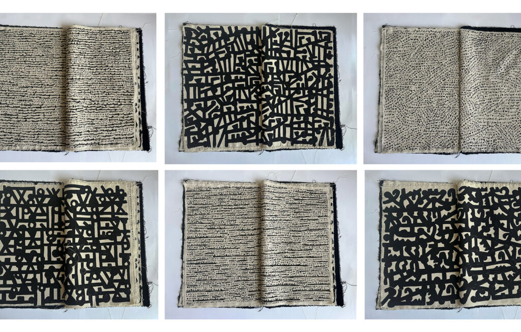
Experimentation with materials expands the possibilities and even the concept for the artist. Material differences between paper and fabric generate distinct atmospheres. “Paper and fabric carry two distinct forms of intimacy,” she explains. Paper allows precision and quiet handling. Fabric introduces weight and movement. In the Written Fabric Book, she sought “to preserve the closeness of a book while shifting it into a heavier, tactile, and stitched material.”
“Unlike paper, fabric carries weight, gravity, and movement. It breathes and drapes in space.” Turning its pages becomes a physical experience. “Each page carries a distinct rhythm. Some are dense and bold, while others are lighter.” The sequence resembles shifts in mood across chapters of thought.
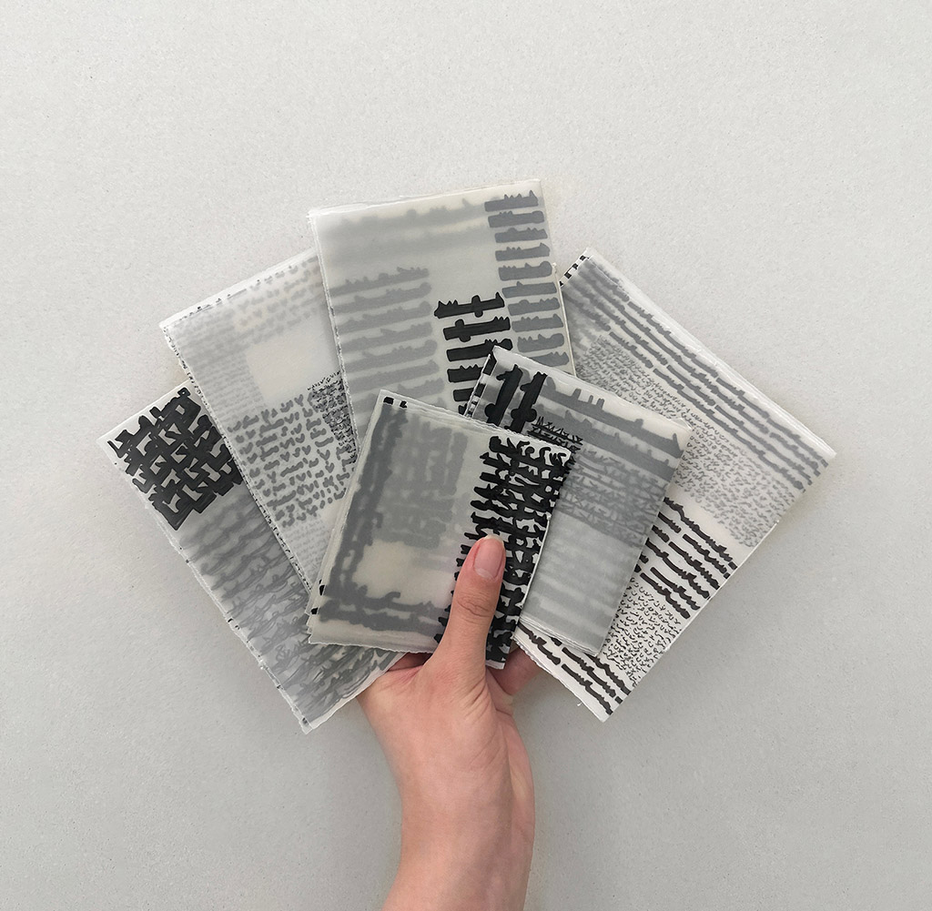
In Transparent Narratives, written on calque paper, the transparency creates overlapping narratives where writings float above and beneath one another. The result feels like hidden conversations, sometimes visible, sometimes fading.
When I say that writing is meant to be felt rather than read, I refer to an experience that becomes unique to each viewer, shaped by their perception and interaction with the work.
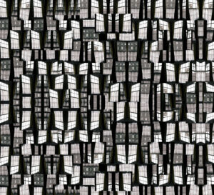
Black and white
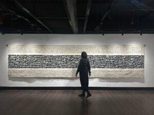
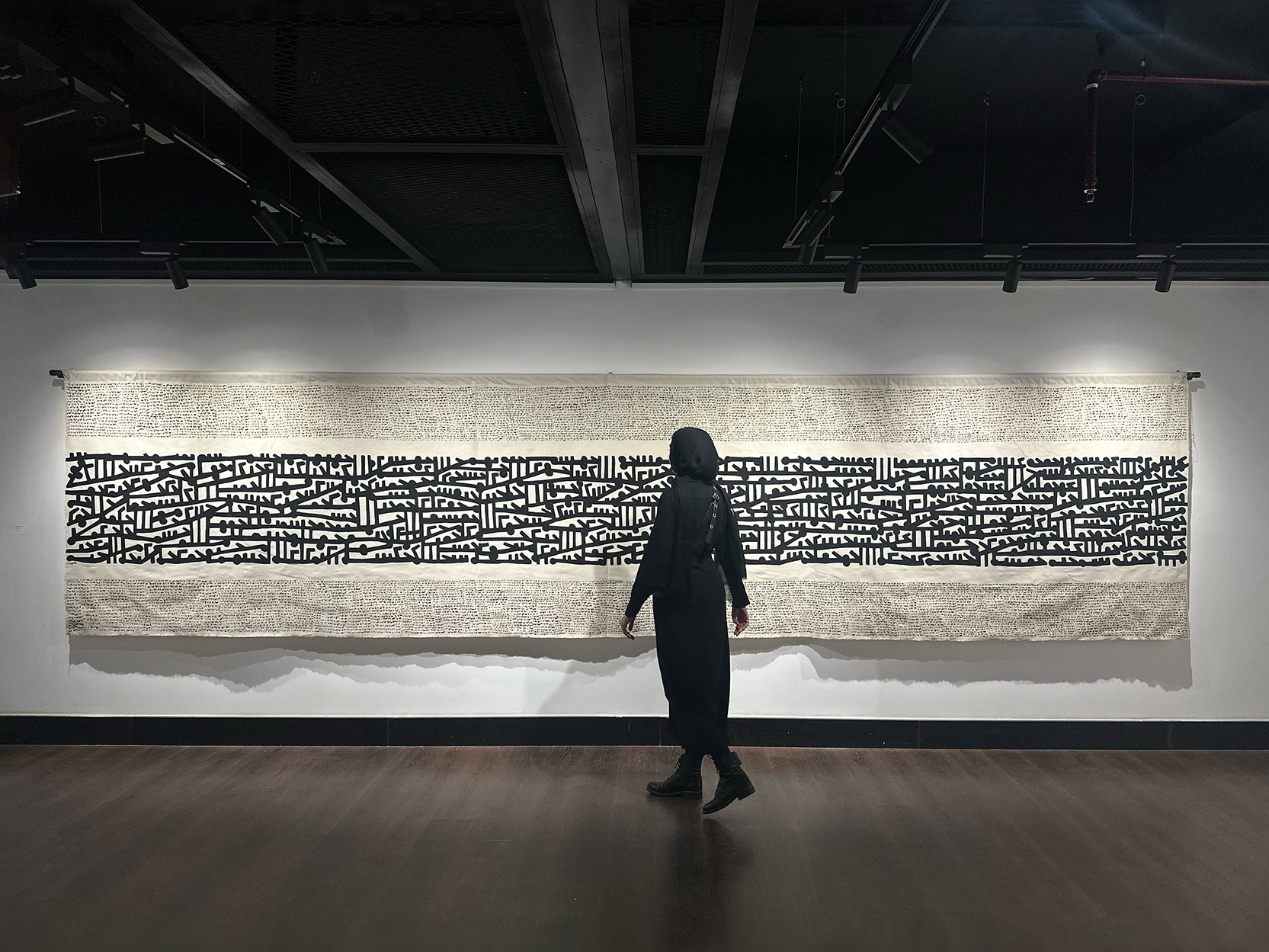
A constant in Abutaleb’s work is the use of black and white, as she feels that monochrome art directs attention to density, rhythm, and gesture rather than semantic meaning. “The black ink gives the work a more abstract ambience, leaving the audience with their own imagination to experience the compositions,” she says. With this minimalist approach, it’s no wonder that scale plays such an important role in how the variations are experienced. Many of her works are produced at large heights and widths to give the artwork a more immersive quality.
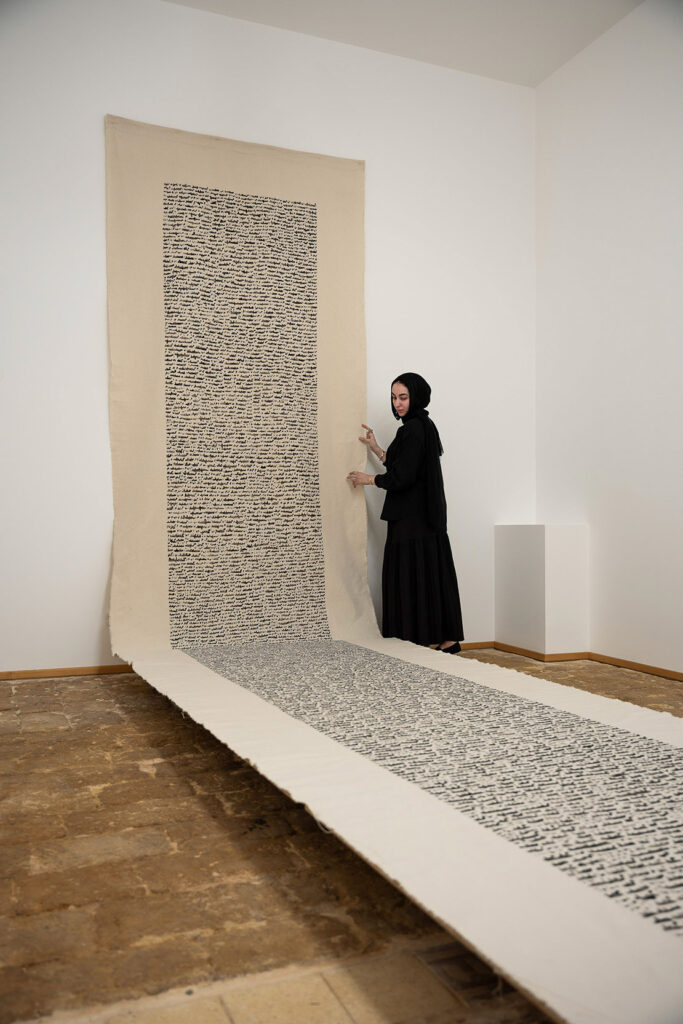
An example is certainly the seven-meter fabric piece “Extended Rhythm” (150 x 700 cm), where the viewer’s body registers a certain musicality from afar, well before the details are visible. “I am deeply drawn to large-scale formats,” she explains. “Working on a piece that stretches seven meters influences the way the work is experienced. A large surface is felt before it is fully seen.” From a distance, the script reads almost like a vibrant monochrome. Only later do the layers and individual marks emerge.
Even for these larger-scale pieces, her process remains improvisational, and she never begins with a fixed plan or a predetermined composition. She may start with a simple thought or a vague idea, but she avoids imposing a rigid structure. “I allow the work to evolve naturally; balance and composition are not decided in advance,” she notes. “They develop during the process itself. The structure appears gradually while writing.” She describes this approach as one of trust, guided by intuition rather than by pre-drawn grids.
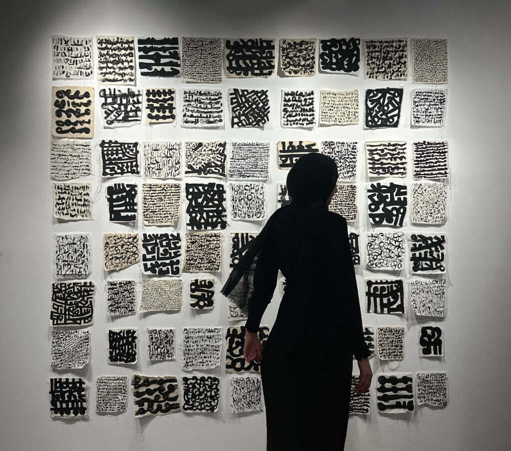
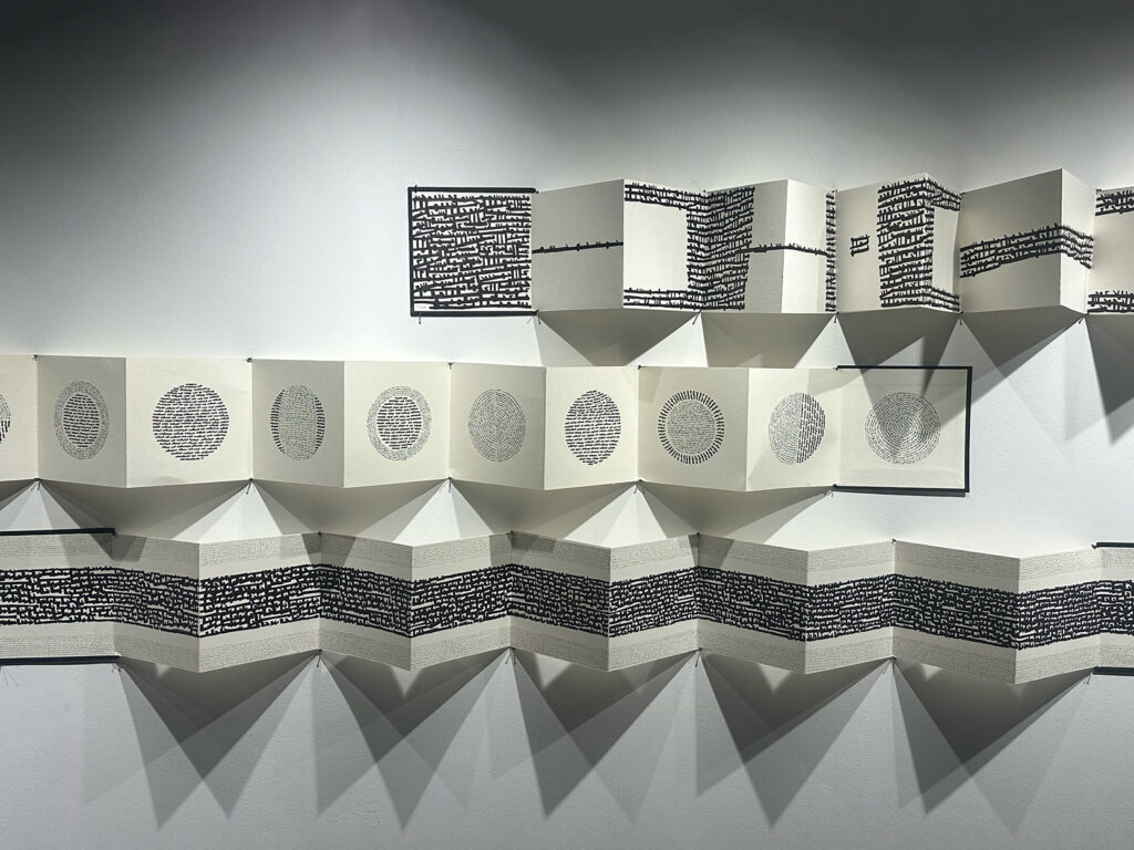
From the large format, she also finds it necessary to go very small. This is the case of a series of 40 miniature books (3 x 4 cm), for which she says she “wanted to shrink writing to its most intimate scale.”
Each miniature holds its own worlds of marks and texts, compressing gesture into a space that fits in the palm. At the opposite extreme, her Unfolding Scripts series (20 x 380 cm) extends writing outward. In several panels, the script stretches, folds, and opens outward, and the eye moves along the surface, experiencing writing as flow.
The movement of the eye
In her practice, her diaries occupy a central place, almost serving as the starting point, where the artist visualizes her thoughts and emotions in Arabic script. They are, in this sense, raw material, and she returns to them regularly.
“I often go back to earlier diaries to understand how my ideas have evolved, as a form of self-dialogue,” she notes. “Lettering art helps me in liberating myself and connecting with the entire spectrum of emotions I might endure; it is an outlet for all my inner thoughts.”
The project Lettering Diaries makes this process explicit, with twenty diaries categorized by days, months, and years and translated into expressive compositions. Again, the words here are not possible to decipher: “The value and the richness of each artwork is embodied in the interaction and the interpretation of the audience.”
Orientation further affects the rhythm of the script. In another piece, “Writing the Horizon,” the horizontal format creates a sense of expansion, and the eye travels from one side to the other in a continuous movement, almost like following a landscape or a distant line.
Circular works, on the other hand, operate differently. In Circular Dialogues, Abutaleb engages with a form that, philologically, has no clear beginning or end. “The eye does not travel linearly, but revolves.” She describes the circle as the most challenging yet interesting form for her: “When text enters the circle, it is held within it, shaped by its boundaries yet constantly in motion.”
A spatial approach is also applied to the treatment of white space, which — although one might expect otherwise — is not guided by the medieval time concept of horror vacui, the need to cover surfaces in signs and images. “I don’t aim to fill space, I aim to interact with it,” says Abutaleb. “I believe that white space isn’t something to be simply filled, but rather a space that allows reflection, and creates a conversation between me and the fabric or the paper piece.”
She sees it as a dialogue with the emptiness which allows the letters and their infinite possibilities to speak.” In this exchange, absence and presence coexist. “My writings break the silence, but it’s never about erasing the space itself; it’s about exploring it.”
From her mother tongue to a universal language
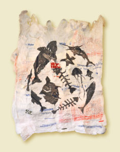
But it’s not all just personal and aesthetic exploration, devoid of any historical and philological research. On the contrary, part of Abutaleb’s work is also in dialogue with tradition. In fact, besides the abstract element of her sign-making practice, Abutaleb has, over the years, also cultivated an engagement with her roots. In Folk Songs Archive 2020, she documents and put into images Egyptian folk songs using the Arabic script. “I am interested in my folk heritage as an Egyptian artist, especially folk literature,” she notes. “More than forty songs were designed in different lettering styles, supported by research and interviews conducted in various areas to access authentic materials.”
Another project, Mawaweel 2023, focuses on what she calls “a genuine, powerful art that is worth being documented and acknowledged.” She wrote six mawals on 100 x 200 cm fabric using black ink. In these works, script becomes a vehicle for preserving and reinterpreting oral traditions. It is clear from her art that she has taken her mother tongue as a primary object of observation, and point of departure for the creation of an almost universalist language. A language that would be “felt,” as she put it.
Today the artist emphasizes the unfinished nature of her inquiry, which will translate into upcoming exhibitions across different cities in the Arab region, as well as in northern Europe. “At the moment, I feel there is still a great deal of energy within me that has not yet been released,” she says in reference to her recent experimentation in the studio.
“As long as I am alive, there are still things I want to say. Writing is not just a practice for me; it is how I process, archive, and express my emotional presence in the world. There is still language inside me waiting to be visualized.”
Discover more of the artist’s work at mariemabutaleb.com.